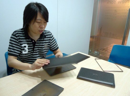
Despite the extremely busy schedule of Design Center folk, I recently managed to grab (literally) a few minutes with Derra Chen – the lead designer on the Eee Pad Transformer project – for a quick, behind the scenes chat about its development and design.
What does the ASUS Design Center do for ASUS?
We help to figure out what people need and want from future products, and then what the best way is to design them.
Does the Design Center look at every product ASUS does or just special ones?
Every product gets looked at in some way by us.
How many groups are there in the Design Center?
There are several groups but they don’t work on fixed products as we operate in more of a multi-function environment. Any team will design any product, depending on their personnel expertise and availability as to who gets assigned to the task.
In the early days of the Eee Pad designs we included a core research and industrial design team. There was a lot of research on how tablets were used and how to get the best experience from them. This needed real end-user feedback so we did plenty of interviews with a whole range of people.
On the transformer design, what was in the inspiration in the design?
It has to be comfortable to read on and watch media because we think the core value to this kind of product is instant video and internet consumption. It has to be extremely mobile for people to take it with them any time. Bigger sizes are better for viewing media, but not too big so that it doesn’t fit in your bag. That’s why we went with 10 inches on the Transformer, although a smaller size is admittedly better to hold and put in your pocket. Our previous experiences from the Eee netbooks told us that 10 inches is preferred, having previously gone through everything: 7, 8, 9, 10 and 12 inches.
How does the Design Center collect feedback for future designs?
We constantly collect feedback from product managers, ASUS global sales teams, media reviews and our social media programs.
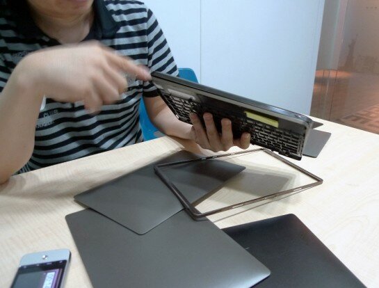
Even before we launched the Transformer, our research found that a keyboard is an essential feature that many wanted, so it was always in our design idea pool. However, after the launch, we now understand that some people find the clipping mechanism difficult to line up or lock properly, so we are looking how to improve this for the next generation.
So why did you choose a textured and not a flat rear side?
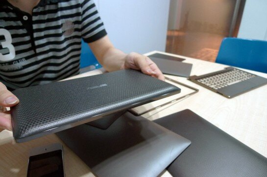
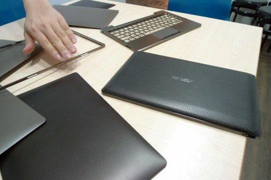
This is one of our findings during initial testing: when you hold a 10″ tablet with a flat backside, it is more difficult without a textured rear bezel. We gave it a texture to enhance the tactile experience and make it non-slip. It also helps to make the tablet look more interesting and beautiful.
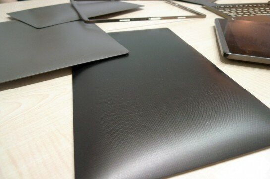
As you can see in this sample of the rear side is in the early development stages, the feeling is not right. The texture is too strong and the curved lip is too acute. The final one has a slightly smoother texture and the curve is moved inwards towards the center, around the area where the fingers grab (rather than palm), so it feels more natural and comfortable.
Why not Black like this one? Why did the Transformer end up with Brown?
The black on this early concept looked too much like a computer. It was too harsh with the texture. We went for brown because it looks more like a leather bag; more like a fashion accessory than gadget, which is important for both the aspect of stylish appeal and to lower the perception of “difficulty”. We also had a pearl white version which looks great until you actually use it. We found after extended use it picked up dirt from fingers too easily within the textured grooves.
How do you balance the feature requests of engineers versus design-centric thinking?
Of course we don’t accept everything. We have to strike a balance between including what tech features people need while sticking to a design-centric development program. That’s an on-going process throughout development.
Why did you choose to use an aluminum keyboard on the Eee Station, and aluminum rim around the pad?
When closed, the two fit together with a single face and texture for symmetry. This certainly looks better and aluminum also gives it a premium feeling.
Did you work with the Slider and MeMo teams work together so they look the same?
Yes, of course, the design is a part our Eee Pad brand. That doesn’t mean it won’t change in the future to create generation distinction though.
Actually we have been working on the tablet well before Computex 2010. At that stage we were working on a pad alone and accessories, like a cover, separate keyboard, extra batteries or a desktop docking rig like laptops use. It was one inter-team meeting in particular that set in motion the Pads we launched this year; we put all these ideas together and the whiteboard was just overwhelmed. It was completely crazy – there was more pen than board left. This was clearly too much – we had too many accessories and our product was not a focused or organized any more. So, we took a step back and changed our goal to be more focused on making it more integrated, simple and beautiful at the same time.
Having come so far in the first design then, how will future Eee Pads evolve?
In addition to the clipping mechanism, we feel the weight is one very important element to improve. Even if we can reduce it by 100g, it makes a big difference. The ideal situation would be to end up with something like a book: as light as paper. Thickness can be offset by usefulness, but lightness is the unparalleled key to avoiding fatigue.
Not only that but paper gives an appealing tactile sensation and interaction too, so it would be interesting to mimic it.
Obviously we can’t make a paper Eee Pad because of the essential requirement of durability and ultimately materials choice depends on the scope of cost and availability too, so the weight issue is always an uphill struggle.
Many thanks to Derra for his time, and if you have any questions for the Design Center, please drop them below or on our Facebook page.
Related Articles
-
http://twitter.com/cloudsmesh Vishal
-
http://www.facebook.com/profile.php?id=566265385 Joanne Sioui Stevenson
-
http://www.facebook.com/profile.php?id=566265385 Joanne Sioui Stevenson
-
http://www.facebook.com/profile.php?id=544615885 Mark Crooks
-
http://twitter.com/cloudsmesh Vishal
-
Anonymous
-
http://twitter.com/cloudsmesh Vishal
-
http://twitter.com/cloudsmesh Vishal

